Tuesday, 15 May 2012

PFT: Ratio Final Idea 1

This is one of the final poster ideas I'm running with based on the world population ratio of 1:1. I took my ratio logo from the last post into illustrator and turned it into a 3D vector which I think makes it look alot better. It was pointed out to me that the first poster below seemed more biased towards females, mainly I think because the frame is primarily magenta. I felt that a texture would work well in the background to just to make it a bit more visually interesting.

The next poster I made I made the frame black and added a crumpled paper texture in the background. The next thing that I thought about changing was the font, another factor I think into making the poster look more feminine. This led me to the 3rd & 4th posters below, I changed 'The ratio of females to males is 1:1,' to a more masculine font and left 'Surprised' unchanged. I think this works alot better but just to try it out I did a version with cyan & magenta text. Having just cyan & magenta in the logo makes the male & female representation alot stronger.


UPDATE: Just spotted the spelling mistake...

Saturday, 12 May 2012

Anamorphic Project: Painting

Below are the photos showing the progress of the anamorphic painting. It took sometime to get the logo looking right, since there's no exact science to it I have to do it by eye using Photoshop. After that was sorted I was good to go!
Painting the piece took alot of time, the wall isn't plastered so I spent most of my time dabbing the paint into all the tiny holes in the breeze blocks. All worth it in the end though :)
Some small parts need touched up along with the final photos and video.


Distorted logo that was projected


Friday, 11 May 2012

Anamorphic Project: Ideas for Painting


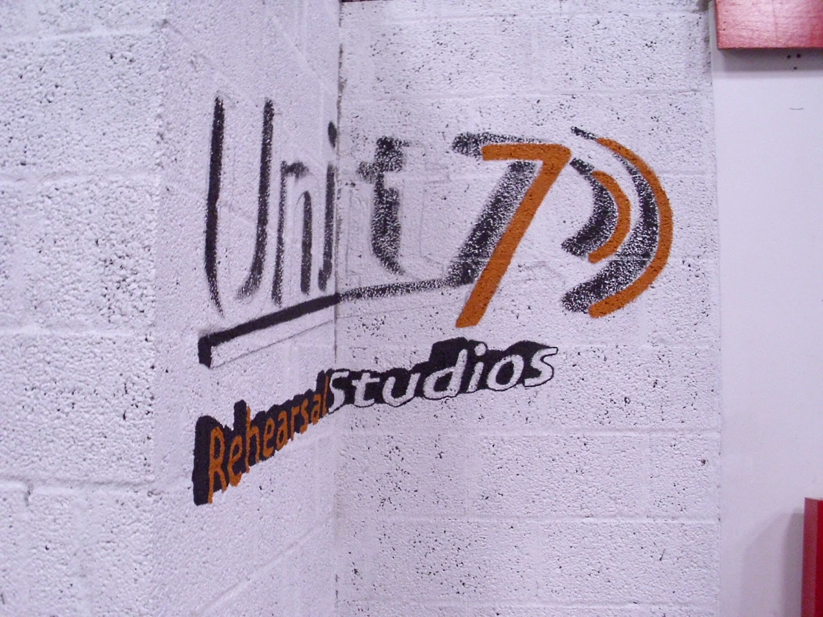
Above are the two logo's currently in use by Unit 7. The 'Audio Visual' logo is on the vans, uniforms & equipment while the other is down at the studio building. Since I will be painting in the new studio I'll be going with the 'Rehearsal Studio' Logo. 


Below are the photoshopped images of the logo onto the wall. At first I simply placed the logos onto the wall but I thought I could do one better than that. I took the logo into Illustrator and made it 3D which looks better visually and also gives me a more difficult challenge of making it anamorphic. I wanted to make use of the already white wall so I'm only painting two colours so I took the colours of the 'Audio Visual' logo. All set to get painting now!  


Thursday, 10 May 2012

Anamorphic Project: Unit 7

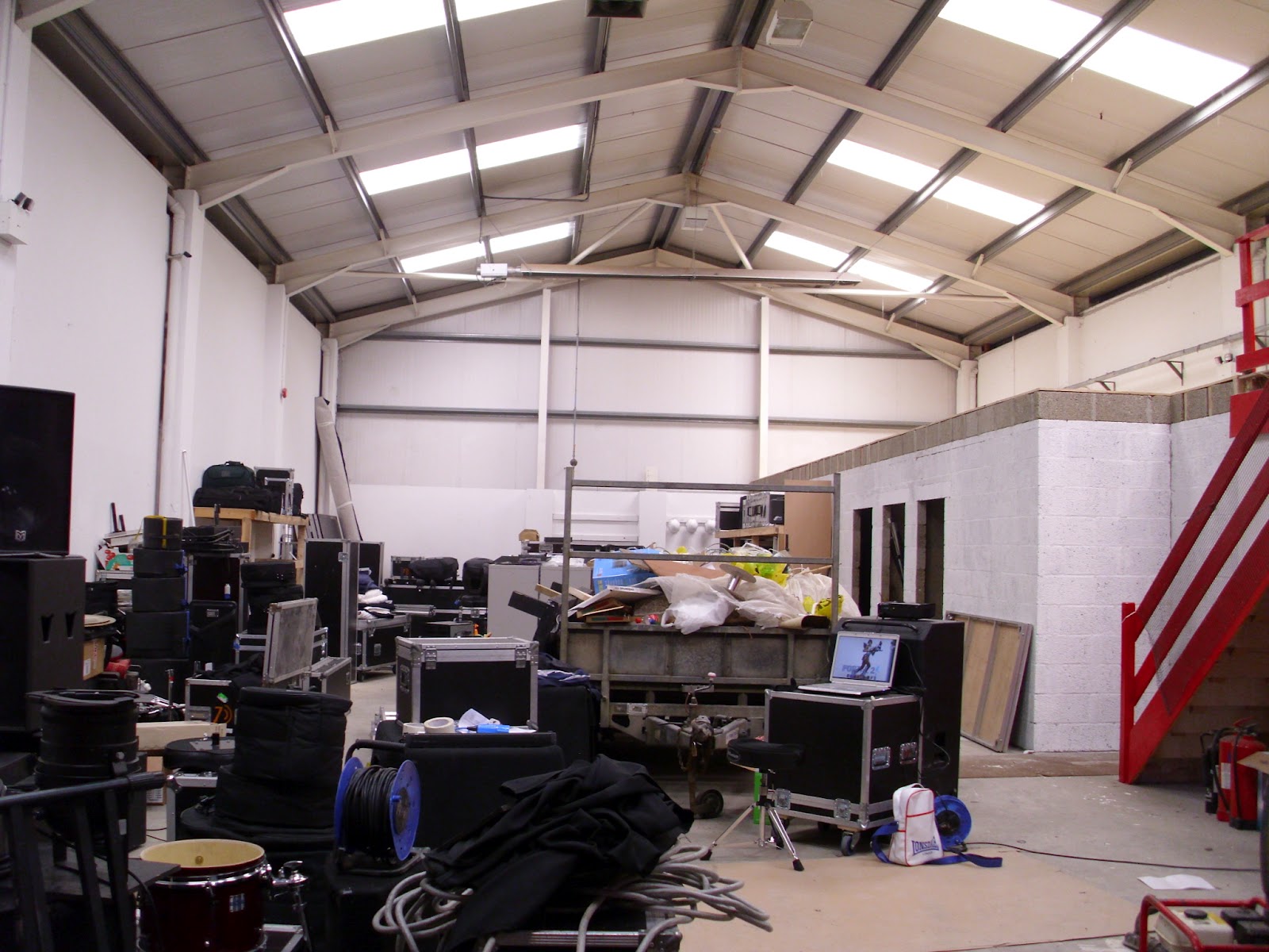
After spending weeks trying to find a location to do my anamorphic typography by chance an opportunity came up. The audio visual company 'Unit 7' who I work for are currently in the middle of moving to larger premises, in the old studio there was a large logo painted on the wall. This gave me the idea to offer them an anamorphic logo down at the new studio.
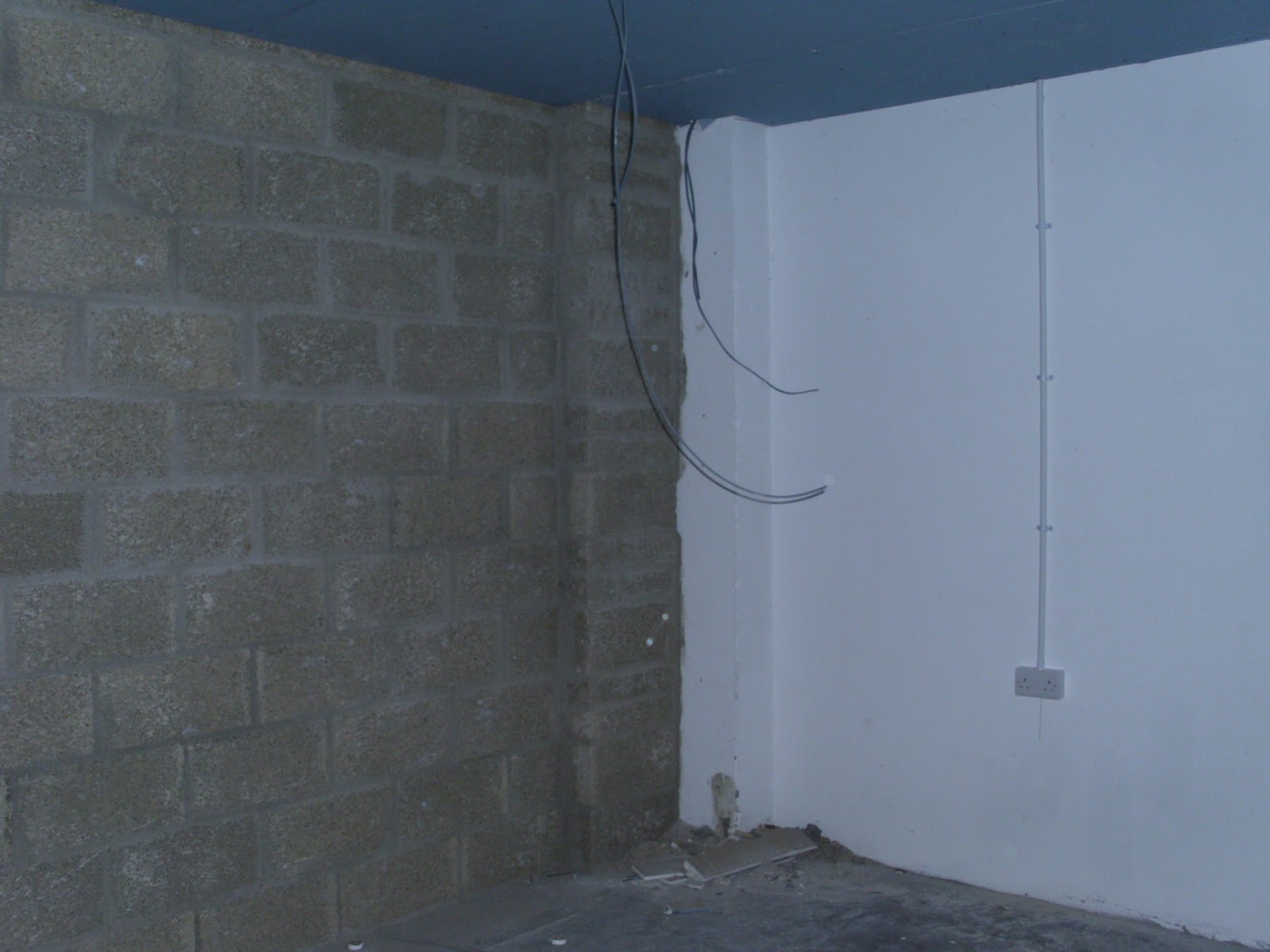
I went down to scope out some walls that I could place a logo, unfortunately the large practice rooms are going to having soundproofing on the walls so they can't be painted. However there's a great corner wall that would be perfect for an anamorphic logo.
The next step is to Photoshop different variations of the Unit 7 logo to plan out what it will look like before I go ahead and start painting.


Tuesday, 8 May 2012

PFT: Development of Ratio Logo


The above images show my development so far of a possible ratio logo for my poster. I started with the typical idea of the male & female logos with the ratio sign but that's too obvious so I began looking at a more creative solution. My next step was to simplify the logo as much as I could, this involved taking the head shapes of the previous logo and enlarging them and adding magenta(Female) & cyan(Male). I like this logo but I'm unsure if it makes sense, perhaps with a tagline underneath it would be fine. More development is needed to find out.
The next step took me off in a slightly different direction, focusing on the word 'one'. I tried several variations incorporating the ':' symbol to see if it conveys the meaning well. I like my second attempt the best but I think I may have lost too much of the word 'one' for it to make sense to anyone reading it. Again development with a tagline will help to see if this is an issue.

Wednesday, 2 May 2012

PFT: Color & texture experiment


 These are quick posters put together so I see how a possible colour scheme works along with a paper texture.

Tuesday, 1 May 2012

PFT: Logo Sketches

Logo Sketches

Ratio Logo Sketches
The above images show some of the sketches I drew developing some logo ideas for the poster. My first sketches are playing with the typical male & female symbols but naturally I want to stay away from these. After doing a bit of research online on several topics I discovered that the worlds population is approximately 1:1. I thought this is a nice topic to run with so I started sketching different ideas.

I did alot of variations based of the ratio ( ':' ) symbol. I wanted to have a simple logo that was effective in getting the point across but also didn't look too cliché at the same time. There's a few that I like but I'm not quite sure that they read the point across, I'm going to re-make them in illustrator and go from there.