Saturday 15 December 2012
Moving to a new home...
This blog has moved to wordpress. You can find my most up-to-date work here at adammcconnell.wordpress.com
Thursday 17 May 2012
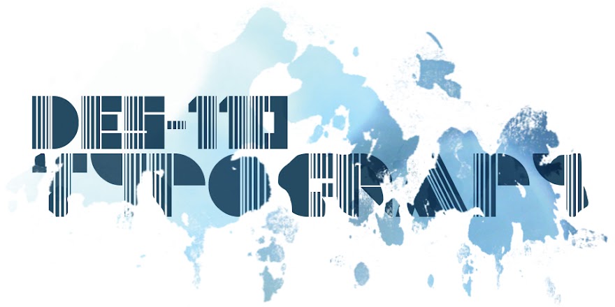
PFT: Final Poster & Proof of Entry
My chosen poster which I submitted to the Poster for Tomorrow competition. This poster is based on the ratio of males and females in the world population which is 1:1. The logo came from the head shape of a generic male & female logo and the ratio symbol. The poster highlights the gender equality in the world´s population but also maybe unearths a false stereotype that there may be alot more males than females.
The entry submission limit is 10 so I'll most likely be submitting a few more.


Wednesday 16 May 2012
Anamorphic Project: Final Photos & Video
Final photos & video showcasing my anamorphic piece. Really enjoyed working on it and I think I'll definitely be trying a similar project again.
.jpg)
.jpg)
.jpg)
.jpg)
.jpg)
.jpg)
.jpg)
.jpg)
.jpg)
.jpg)
.jpg)
.jpg)
High res video: http://www.youtube.com/watch?v=TydoSZ8EkfA&feature=youtu.be
Tuesday 15 May 2012
PFT: Ratio Final Idea 2.1
I took a slightly different approach with the last idea, it wasn't working for me. I'm into 3D vectors at the minute so I couldn't resist turning my 'O : E' logo into one. I think it looks alot better than where the last idea was going but the first poster seems to read alot better. I'm not sure if the message is clear enough in this poster.
(RGB).jpg)
.jpg)
PFT: Ratio Final Idea 2
Another slogan I wanted to try was 'Two genders, one equal right' which allows me to incorporate the ratio 'O : E' logos I designed previously.Although the slogans different I'm still using the same colour scheme and texture, might be an idea to try a different approach and see where that goes. My concern with this poster is that the population ratio isn't clear, the literal visual translation of 'O : E' doesn't read 'the male & female world population is 1:1'. Perhaps if the 'O' & 'E' was cyan & magenta then maybe it might make more sense.
.jpg)
(RGB).jpg)
)RGB).jpg)
(RGB).jpg)
PFT: Ratio Final Idea 1
This is one of the final poster ideas I'm running with based on the world population ratio of 1:1. I took my ratio logo from the last post into illustrator and turned it into a 3D vector which I think makes it look alot better. It was pointed out to me that the first poster below seemed more biased towards females, mainly I think because the frame is primarily magenta. I felt that a texture would work well in the background to just to make it a bit more visually interesting.
The next poster I made I made the frame black and added a crumpled paper texture in the background. The next thing that I thought about changing was the font, another factor I think into making the poster look more feminine. This led me to the 3rd & 4th posters below, I changed 'The ratio of females to males is 1:1,' to a more masculine font and left 'Surprised' unchanged. I think this works alot better but just to try it out I did a version with cyan & magenta text. Having just cyan & magenta in the logo makes the male & female representation alot stronger.
.jpg)
(RGB).jpg)
(RGB).jpg)
(RGB).jpg)
UPDATE: Just spotted the spelling mistake...
Saturday 12 May 2012
Anamorphic Project: Painting
Below are the photos showing the progress of the anamorphic painting. It took sometime to get the logo looking right, since there's no exact science to it I have to do it by eye using Photoshop. After that was sorted I was good to go!
Painting the piece took alot of time, the wall isn't plastered so I spent most of my time dabbing the paint into all the tiny holes in the breeze blocks. All worth it in the end though :)
Painting the piece took alot of time, the wall isn't plastered so I spent most of my time dabbing the paint into all the tiny holes in the breeze blocks. All worth it in the end though :)
Some small parts need touched up along with the final photos and video.
.jpg) |
| Distorted logo that was projected |


Friday 11 May 2012
Anamorphic Project: Ideas for Painting


Above are the two logo's currently in use by Unit 7. The 'Audio Visual' logo is on the vans, uniforms & equipment while the other is down at the studio building. Since I will be painting in the new studio I'll be going with the 'Rehearsal Studio' Logo.
Below are the photoshopped images of the logo onto the wall. At first I simply placed the logos onto the wall but I thought I could do one better than that. I took the logo into Illustrator and made it 3D which looks better visually and also gives me a more difficult challenge of making it anamorphic. I wanted to make use of the already white wall so I'm only painting two colours so I took the colours of the 'Audio Visual' logo. All set to get painting now!


Thursday 10 May 2012
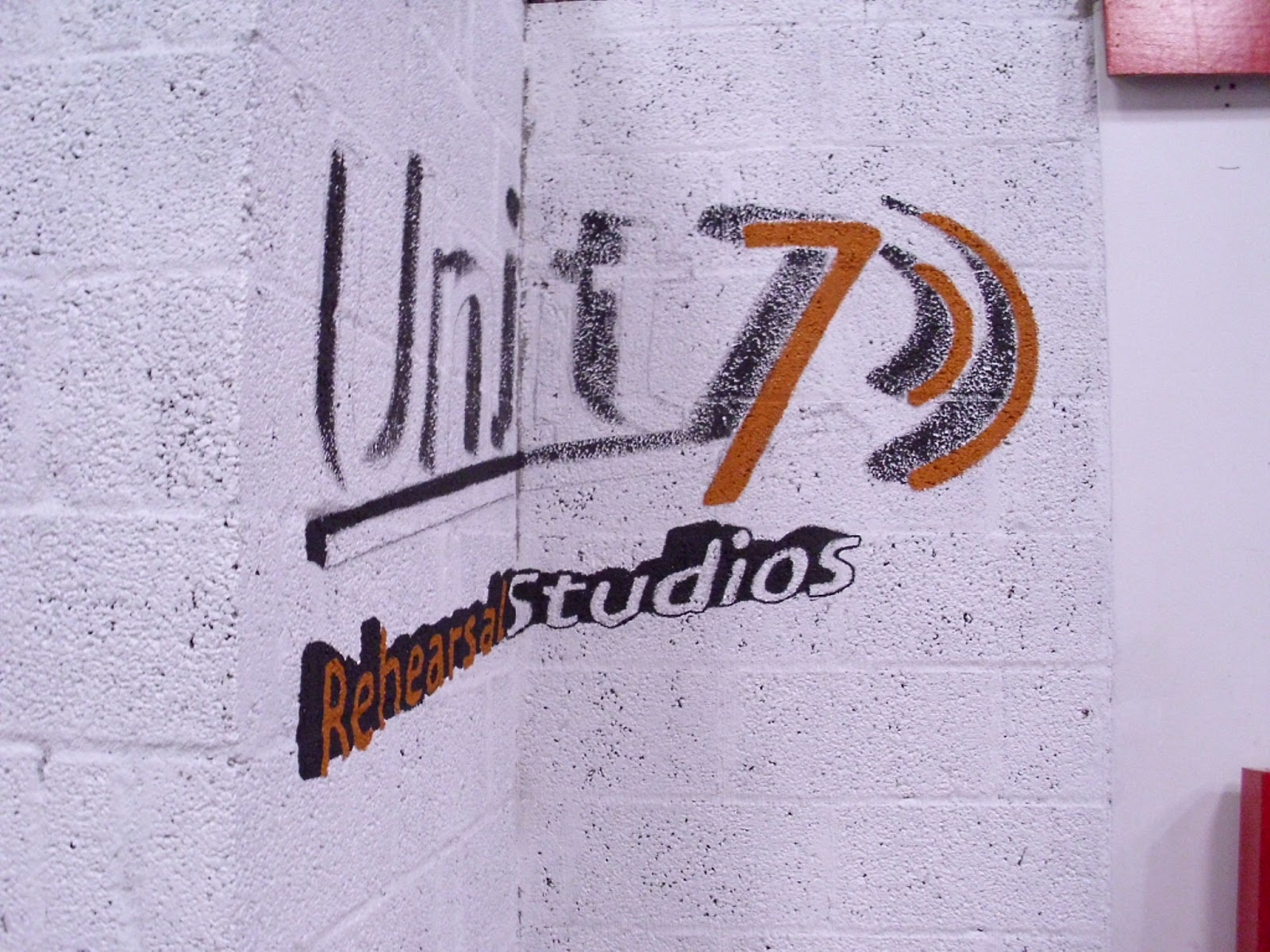
Anamorphic Project: Unit 7
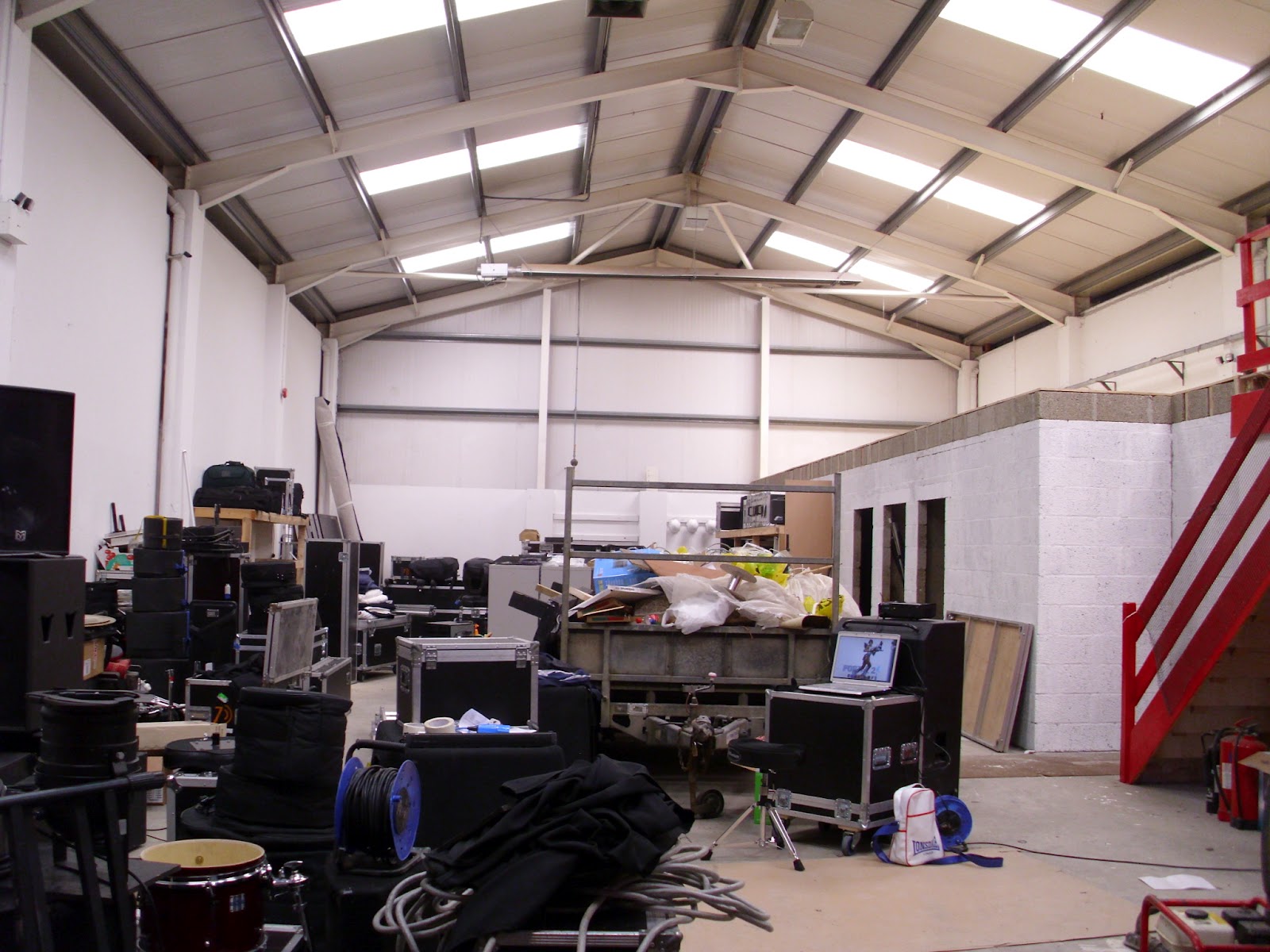
After spending weeks trying to find a location to do my anamorphic typography by chance an opportunity came up. The audio visual company 'Unit 7' who I work for are currently in the middle of moving to larger premises, in the old studio there was a large logo painted on the wall. This gave me the idea to offer them an anamorphic logo down at the new studio.
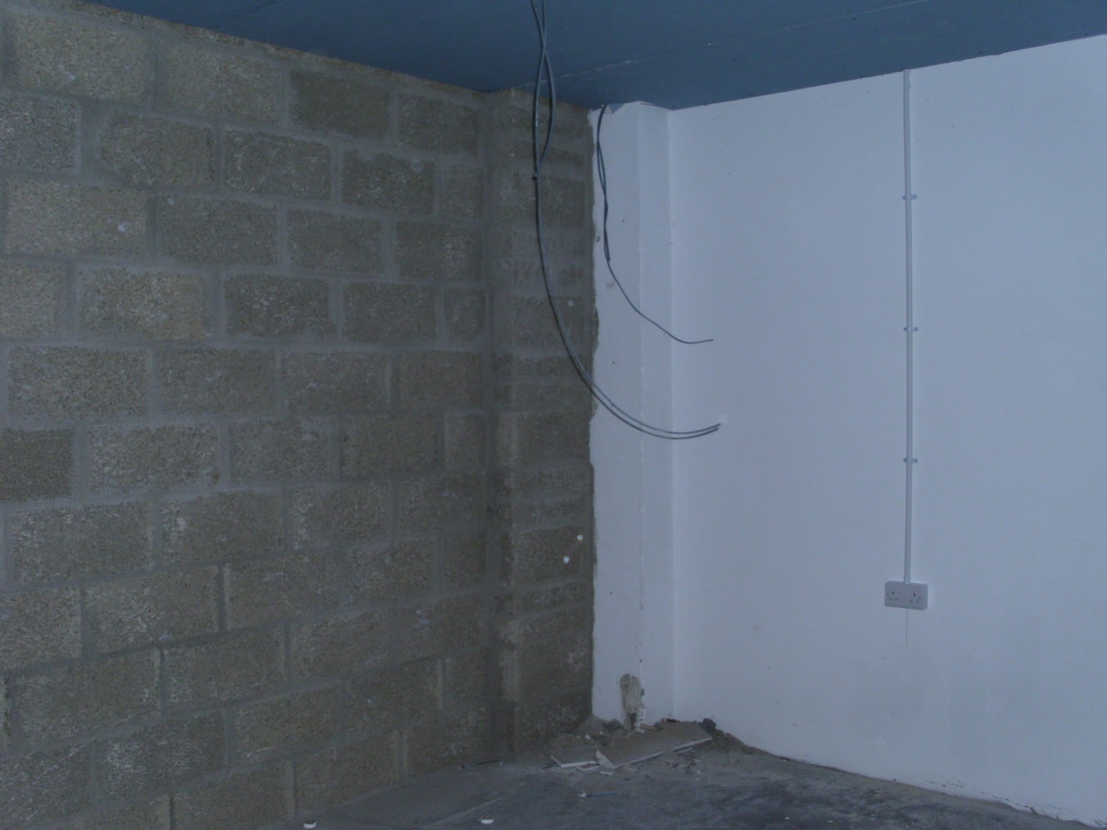
I went down to scope out some walls that I could place a logo, unfortunately the large practice rooms are going to having soundproofing on the walls so they can't be painted. However there's a great corner wall that would be perfect for an anamorphic logo.
The next step is to Photoshop different variations of the Unit 7 logo to plan out what it will look like before I go ahead and start painting.


Subscribe to:
Posts (Atom)