Saturday 25 February 2012

Inspirational Inspiration...


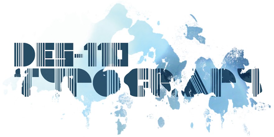
Above are a few examples of Typography that I find interesting;
  • The burger I think is fantastic as the names of the ingredients make up the image of the burger.
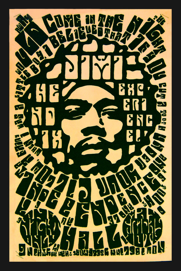
  • The Hendrix poster is a bit difficult to read but it's pretty sweet looking, a common challenge I find when experimenting with type- finding that line between being legible or illegible.
  • Finally the portrait of Oscar Wilde, a pretty cool example of creating portraits out of type.

Wednesday 22 February 2012

Clever Typography

While doing my usual tour of websites to see what's new I came across some clever use of typography(http://www.demilked.com/logos-with-hidden-symbolism-part-iii/)

I'm into the idea of incorporating the meaning of a word into it's design, in most cases it's likely not going to be easy but I'd like to give some of them a try.
Below are few examples I've selected off the website but you should follow the link and check them out yourself :)
'Nine TV'
'Height'

'Wave'


'Freedom'

If like me your looking for more then links to parts 1 & 2 are posted below;

Thursday 16 February 2012

Natural Grid Templates


Example layout designs based on natural gridlines found in buildings. I never would have thought looking at building façades for grids but it's definitely something that catches my eye now... 
as well as random objects that look like letters...

Tuesday 14 February 2012

Au Naturale Type

'A-Z Natural Type'
Above is my own type face created from objects and natural forms. I have to admit that you do look slightly mental taking photos of splashes of paint, cracks in the ground, railings, pipes and other things that make no sense to passer-bys except you  but if you open your eyes there's so many letters in natural forms. 
So if,like me, you want to get hands on within your design work and create handmade or natural elements then you'll to accept you'll have to be a bit weird, designers are wired differently than most people, which is fun...
...most of the time.

Anyway getting back on the topic at hand. I'm going to refine this A-Z as I think some letters definitely have room for improvement or depending what mood I'm in then I might just scrap the whole thing all together...