
For this project I'm thinking about doing anamorphic typography. This kind of type has the potential to be quite a challenge as it's not making the type that's going to be the problem, it's finding a space to do it. I'll have to start scouting out disused buildings or walls that nobody will mind if I artistically deface.
I've been scouring the web tracking down examples and it appears that only a select few keep cropping up all over the place which usually means that not alot of people have done this (Which could hint that's it's not going to be easy...) but I see this as an upside as it means that I can try alot of ideas that haven't been done before. I've posted lot's of examples below so I (and you =] ) can get an idea of what anamorphic type is.


 |
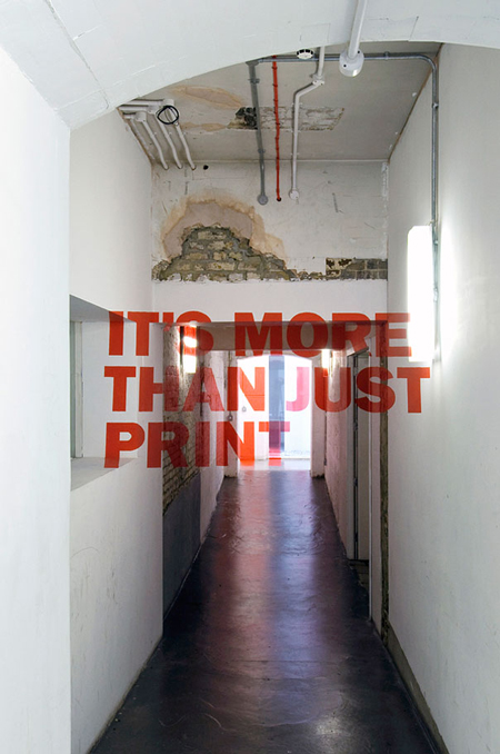
| Axel Peemoller |
http://de-war.de/


 |
| Greg Dubois |

 |
| Joseph Egan & Hunter Thompson |
http://www.designboom.com/weblog/cat/8/view/11093/joseph-egan-hunter-thompson-anamorphic-typography.html

 |
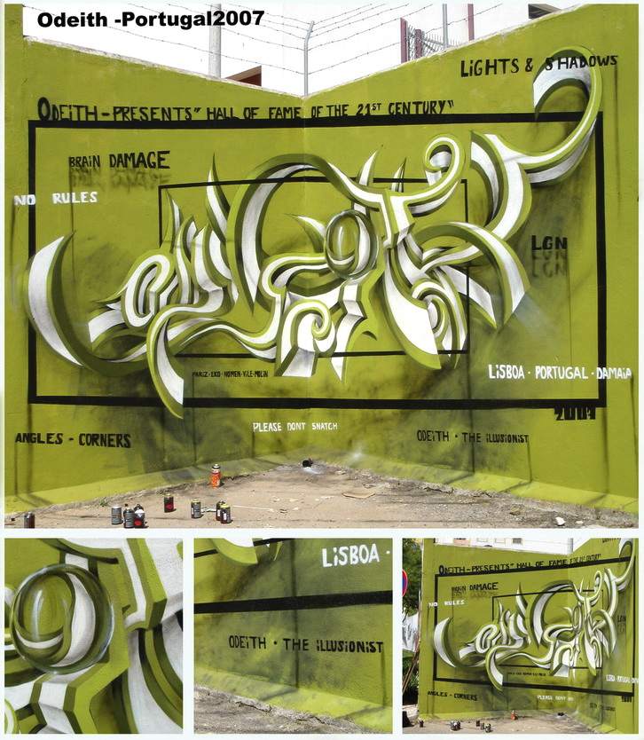
| Odeith |
http://odeith.com/en/anamorphic
I remembered an artist I seen a long time ago called Felice Varini, he's an anamorphic artist. His work doesn't deal with typography but his work is still an excellent example of Anamorphic illusions. Below are only a few of the huge amount of illusions he has created, I recommend taking a look at his website.


No comments:
Post a Comment