Wednesday, 14 March 2012

Experimenting with anamorphic type #1

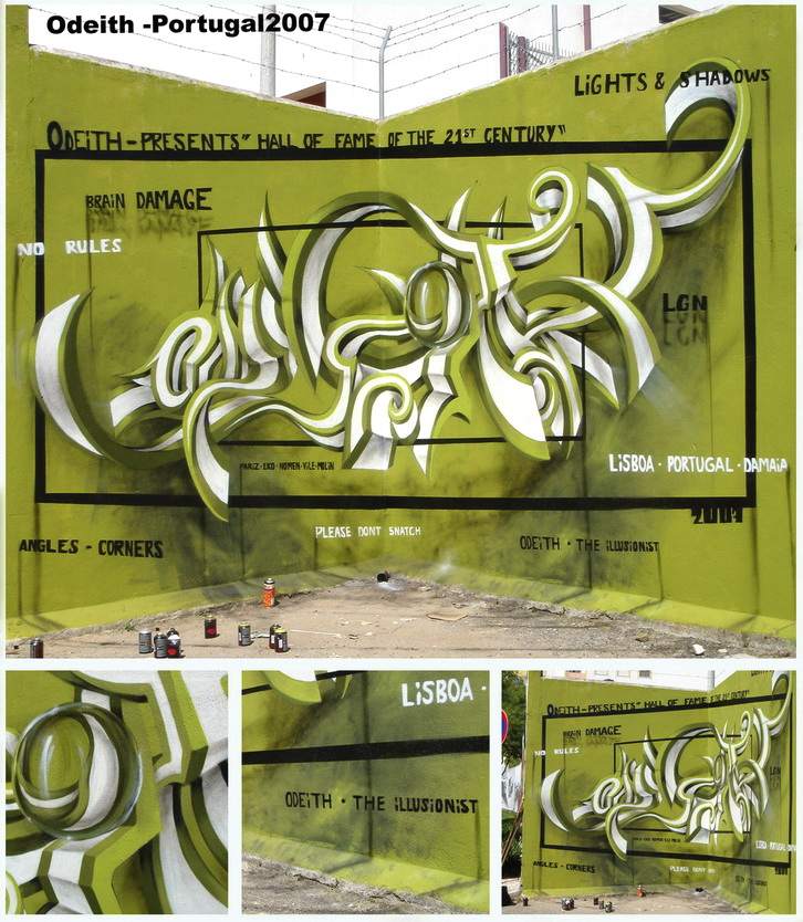
Today during class we had an opportunity to work on our projects so I used the time to experiment with an anamorphic rectangle. To get my first line I placed a steel ruler across the corner of the wall,shone a light behind it and traced the shadow it made. I completed the rectangle with parallel lines to see what it would look like and it looked out of proportion... It was wishful thinking that I'd have success first try.
Looking through the camera I found that I had to move the line downwards to make it appear parallel the top line, 6 lines later we had a winner. The next lines to fix were the two at the side, they appeared to be sloping inwards when drawn straight so I had to re-draw them slightly angled ("/ \") to appear parallel through the camera.
For a first attempt I'm really impressed, I was assuming I was about to make a complete mess of it. There's hope for this project yet :)


I tried putting a smaller rectangle within the rectangle I just drew but  time was against me and I rushed it, making it slightly crooked. So rule no.1, take your time :)


Friday, 9 March 2012

Pro:Five- Anamorphic Typography

For this project I'm thinking about doing anamorphic typography. This kind of type has the potential to be quite a challenge as it's not making the type that's going to be the problem, it's finding a space to do it. I'll have to start scouting out disused buildings or walls that nobody will mind if I artistically deface.
I've been scouring the web tracking down examples and it appears that only a select few keep cropping up all over the place which usually means that not alot of people have done this (Which could hint that's it's not going to be easy...) but I see this as an upside as it means that I can try alot of ideas that haven't been done before. I've posted lot's of examples below so I (and  you =] ) can get an idea of what anamorphic type is.


Axel Peemoller

 http://de-war.de/ 


Greg Dubois


Joseph Egan & Hunter Thompson
  http://www.designboom.com/weblog/cat/8/view/11093/joseph-egan-hunter-thompson-anamorphic-typography.html 


Odeith
http://odeith.com/en/anamorphic

I remembered an artist I seen a long time ago called Felice Varini, he's an anamorphic artist. His work doesn't deal with typography but his work is still an excellent example of Anamorphic illusions. Below are only a few of the huge amount of illusions he has created, I recommend taking a look at his website.

Tuesday, 6 March 2012

Clever Book Cover Designs


These clever book designs are the work of Swedish-based graphic designer Patrik Svensson. They're very creative manipulations of the titles of the books, my only complaint would be the boring gradient of grey on the covers.
My two favourites have to be 'Moby Dick' & 'The Da Vinci  Code', the Da Vinci cover being my favourite as even though it looks illegible you can still make sense of it.

Check out his website http://www.princehat.se, theres loads of fantastic & creative work :)

Monday, 5 March 2012

Refined A2 Poster Ideas


I tidied up the alignment of text in my previous idea and made a poster with a single paragraph of text. I also tried overlaying Yellow & Cyan on top of the poster just to see what they would look like with colour. I think the black & white designs are probably best suited to the topic, not sure if I like the single paragraph poster as I have alot of information to put on and can't really afford to chop away anymore info.

Saturday, 3 March 2012

A2 Poster Ideas

Idea one

Idea two

Idea three
Above are three different poster designs. Not quite sure which one I should refine for a final idea but I thinks it's between idea 1 & 3. My topic is 'Coin a phrase' but this also ties in with letterpress so that's the style I'm trying to go for. I think all these ideas still need abit of work, there's missing something... I'm just not quite sure what it is yet.

Defacing newspapers... artistically ;)


I never read newspapers but I may have found a reason to buy a few...
In class we were told to use the paragraphs as grid squares to fill with larger letters, it was a interesting exercise and I enjoyed doing it. I couldn't resist changing the picture of the guy holding the placards...

Friday, 2 March 2012

Typographic Banner

Below are photographs of the hand-drawn type banner that we created in class. In our group we folded the banner in random directions to give us our grid lines to work on, it left some interesting shapes to design on.
I'd never tried hand drawing type before because the last time I tried it I wasn't particularly good at but I must admit I was pleased with my effort on the banner :)